After spending a lot of time researching sequencers that fit my needs and desires, Metropolis has turned out to be the best option, by far. I’m incredibly excited about it.
However, the original Metropolis was released in 2012. It’s also currently out of stock. I’m sure Intellijel’s abilities, design and production methods are far better in 2020 than they were in 2012, and I’d love to see an updated take on the Metropolis, with more channels of sequencing, an updated display, more sophisticated quantising (editing of scales), and whatever else Intellijel can cook up.
What are the chances we’ll see an updated Metropolis some time soon? What’s the normal lifespan of a module?
Needs and desires: A very tweakable way to create happy accidents and organic melodies without the need for a separate quantiser, and without too much menu diving. Constant time portamento is a huge plus, too.
2 Likes
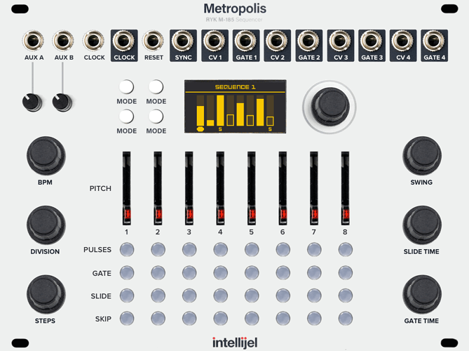
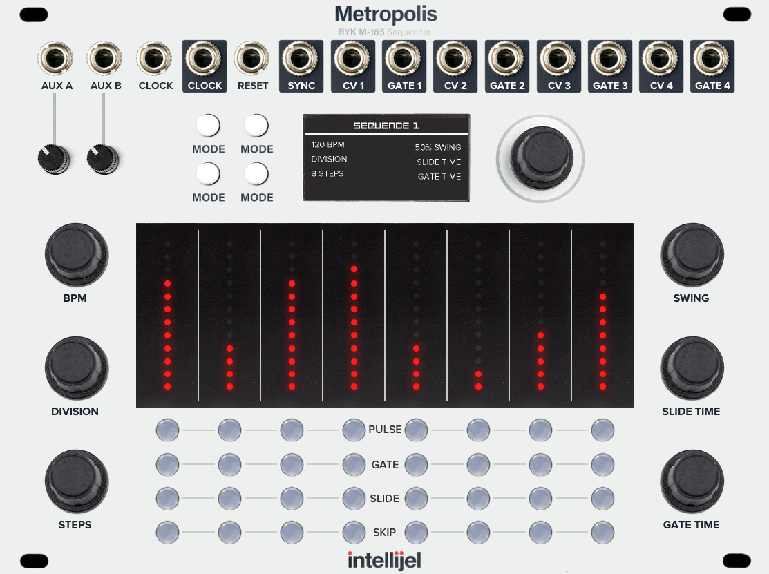
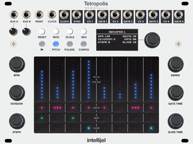
Here’s a mockup of how it could look with four sequences. The display and encoder have been taken from the Rainmaker. The slide and gate time have been moved into menus. The buttons under the menu could probably be refined, and I’ve been a bit hand-wavy on how everything would be accessed, but I think there’s enough space to do a good job supporting everything that’s needed, without requiring too much additional menu-diving.
Thoughts?
Here’s a comparison of the current Metropolis vs my concept.
1 Like
I’d really dig probability control for triggering of gates. also: more CV inputs, ability to change scale via CV. Ability to swap between saved sequences via CV.
I’d gladly pay for these features!
Yep! That would all be great. An updated model with even half that stuff would get my money.
Your mock up looks rather stunning!
Reminds me a bit of Stillson Hammer mk2.
The problem with this approach is that slider/switch settings will not correspond to the actual values once you switch channels/tracks.
The immediacy of today‘s Metropolis is why I still call it the most fun sequencer to play with. I wonder what the UX will be like when hardware positions and actual values get decoupled.
Wait, I have solution! Motorized faders and click buttons (instead of switches) with lights indicating their setting. Ok, done! 
Thanks!
The problem with this approach is that slider/switch settings will not correspond to the actual values once you switch channels/tracks.
Yep, I agree, but I don’t see an easy solution without increasing costs (motorised faders, as you suggested) or without increasing size and cost (just make the module bigger with more faders).
I think the display helps letting you know the true state of the sequence.
Wait, I have solution! Motorized faders and click buttons (instead of switches) with lights indicating their setting.
I think buttons to cycle the modes for the pulse and gate mode switches would be a great solution. That keeps them compact, and they’re not that much harder to use. For pulses, maybe having an up and down buttons or an encoder would be good. I have other ideas I’ve mocked up using encoders. It seems like it would detract from the immediacy of the Metropolis faders, but maybe it’s a good trade-off?
The immediacy of today‘s Metropolis is why I still call it the most fun sequencer to play with. I wonder what the UX will be like when hardware positions and actual values get decoupled.
That’s definitely a concern. I think the René also has that issue, and it still seems great? It’s not always going to be an issue — it’s only when you start using more than one sequence, or if you want to save and load sequences. I have a Sansamp PSA-1 that has a similar issue and it’s honestly fine. The benefit of saving outweighs the physical dials getting out of sync with the actual values.
1 Like
The pitch slider (faders?) are the main issue in terms of position and actual pitch.
The rest should be doable. I like your up-down button idea.
For pitch as well as steps encoders with LED rings around them might be an ideal solution. But that would be a big deviation from today‘s familiar interface.
I never had a problem with René 2 with regards to the knob positions. All the Snake and Cartesian modes make for a quirky way of sequencing anyway and I did not mind not being able to read the actual values when switching tracks. Add to that the ease with which one can copy a whole set of pitch values and copy them to a different track and it really wasn’t an issue at all.
Fodder for UI/UX analysis. 
While we’re at it, why don’t you post some of your other mock ups? I’m really interested.
Given it seems like there isn’t a Metropolis 2 due for release soon, I bought a Metropolis. 
For pitch as well as steps encoders with LED rings around them might be an ideal solution. But that would be a big deviation from today‘s familiar interface.
I totally agree. The sliders really make the Metropolis so approachable and quick to work with. Using encoders would be a big step backwards. Would the trade-off be worth it? I’m not sure. If only motorised faders were cheaper!
I guess if we want multiple sequences and to be able to see what’s going on, playing that design process out to the end results in something like the Five12 Vector. The Vector looks awesome, but is pretty different and less immediate than the Metropolis.
While we’re at it, why don’t you post some of your other mock ups? I’m really interested.
Thanks! I have some that are radically different to the Metropolis, heading more into the Vector territory, and some are more of an evolution of the Metropolis. I’ll post the Metropolis-like ones here as soon as I can. The other designs still require more work. I don’t have the experience required, but I am considering attempting to build something as a fun side project.
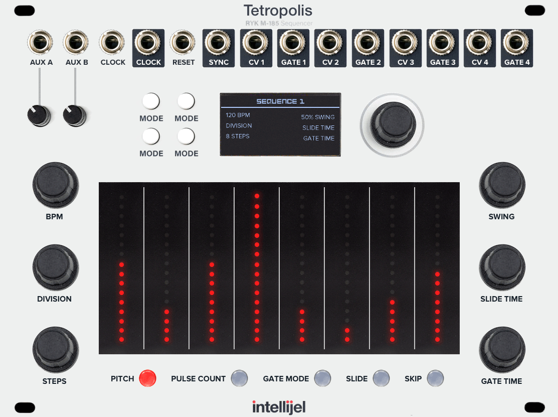
Here’s another mockup. All switches have been replaced by buttons with LEDs. Skip and slide now have their own buttons (rather than being combined into a single press and double press button).
Pressing the pulses and gate buttons would cycle through the number of pulses and gate types. Holding a pulses or gate button and turning the encoder would allow quicker changes, with feedback on the display. Like the Quadrax, these buttons could change colour depending on the gate mode or number of pulses.
BPM, division, steps, and swing all have dedicated encoders. The slide and gate time dials have been added back as encoders. Pressing the encodes could jump to more options on the main display.
The only part of the module that can’t reflect the current state when switching sequences is the sliders/faders, but the display would show the correct state just above. Not perfect, but still pretty good.
I’ve glossed over the functions for the buttons to the left of the display. These would likely be play/pause, and whatever else is needed to make navigating menus on the display a little easier. Given there’s a full display and an encoder, I think everything could pretty easily be worked out in a way that doesn’t require too many deep menus. Remember that the lower six encoders can all be used as a shortcut to jump to the respective screen, so we don’t need dedicated buttons to the left of the display for those.
What do you think? Is this an improvement?
The slider dynamic state issue has already been solved by another Intellijel product… the Tetrapad. So, Metropolis could just borrow some ideas from there. And with this version, we’re now a very long way from the original Metropolis. But, everything is dynamic. Holding a pulse or gate button could even show the state and allow editing in the Tetrapad area!
The display wouldn’t need to show the sequencer data any more — it can now show other useful information, like the tempo, swing etc. There’s definitely still some areas I’m glossing over, but I think this would be pretty awesome.
2 Likes
But, if you’re going to do that, you may as well go all the way, showing pulse count, gate mode, slide and skip in the Tetrapad area, with a way to change what’s shown, allowing for a far larger touch surface. The values for pulse count and the icons for gate mode could now be printed on the Tetrapad area.
You know what? There’s actually enough height to potentially edit gate mode, slide and skip all on the same surface, removing more buttons and making it even faster to use with less toggling between modes. I have so many more ideas for this thing! Hopefully I’ll get a chance to give it some more thought and post another mockup soon.
3 Likes
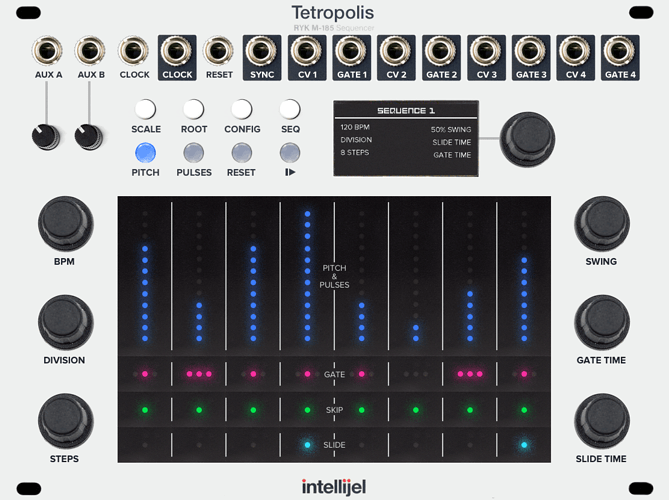
And. if you did that and changed the colours to match the Tetrapad’s colours for pitch CV, gates etc, it could look like the mockup below. There’s not enough space to fit pitch and pulse count stacked on top of each other, but they could be toggled via the “Pitch” and “Pulses” buttons above (there could also be shortcuts for this, using chorded actions on the Tetrapad, like holding in the gate/skip/slide area while also moving the value above).
The great part in using the touch zones is that you could drag your finger from left to right, moving it up and down across all sliders to quickly create a pattern in a single stroke.
I think this would be really quick to work with. I want this! How can we make it happen? Help!
4 Likes
Wow! What you guys are coming up with is simply awesome! Combining the Tetra’s pads with Metropolis is such a good idea!
I reeeally wonder if Intellijel is in any way working on a new Metropolis.
It was my first sequencer and it’s still the most fun to use. If only it had more than one track.
I have used MANY others since and am now a Vector evangelist, but a new Metro would be a no-brainer for me.
1 Like
@marcedwards, I was so inspired that I had to post your mock-ups in the Eurorack group on Facebook.
Please let me know if you want to remove that post!

1 Like
I’m all for this idea spreading. I would love it to become a reality, somehow. I’m not done yet… I still have lots of ideas that could improve things. More coming!
1 Like
That’s great!
Let’s make it happen. 
Can I tag you on Facebook?
How about this: take your first Tetropolis design. Add another two aux ins under the first two. Add a second CV out per track and put the clock, reset, etc. outs to the right underneath track four’s outputs.
Just imagine the possibilities!!
1 Like
Yeah, I think having 4 generalised aux inputs that can be used for additional clocks, or modulating more things would be amazing. There’s definitely space to add them.
I’m not on Facebook, sorry!
Here’s another mockup that cleans up a few things, shuffles some buttons so they make more sense, and adds countersunk screws.
1 Like


